(English below)
Dans la foulée de la refonte de nos fondamentaux, il nous est apparu naturel de faire évoluer aussi notre image!
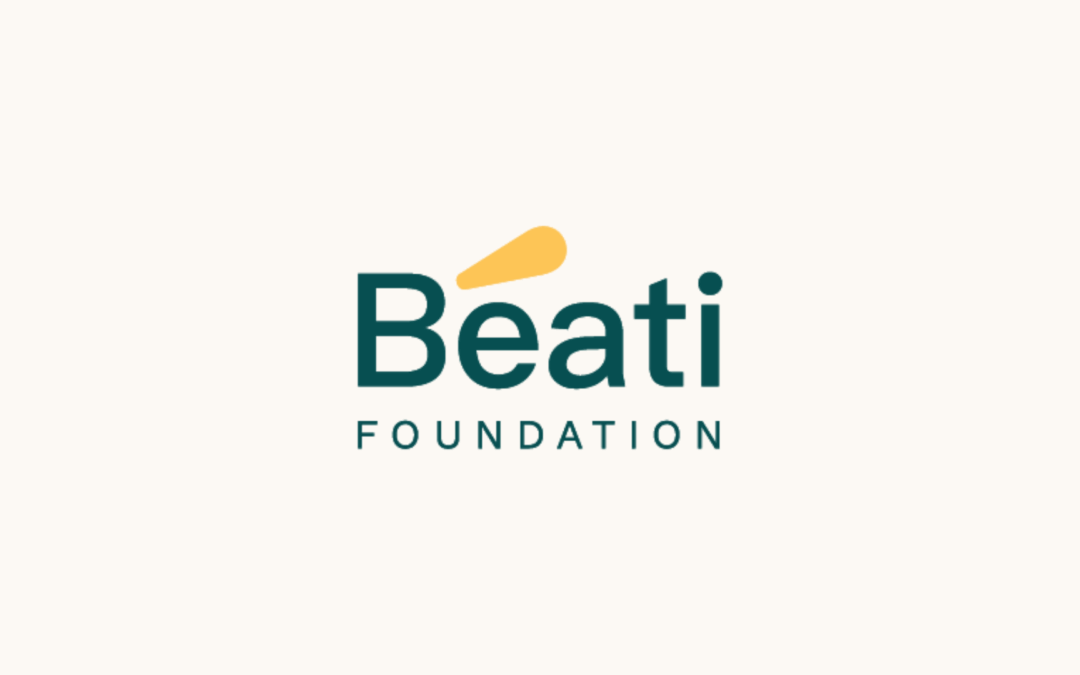
La Fondation Béati dévoile aujourd’hui une nouvelle identité visuelle, en continuité avec les transformations engagées depuis les dernières années.
Ce nouveau logo se veut simple, clair, tout en incarnant les valeurs centrales de notre Fondation.
Il intègre une palette de couleurs choisies avec soin pour refléter notre vision :
un vert profond, qui évoque la responsabilité et l’intégrité ;
un jaune lumineux, symbole de vivacité et d’espoir.
L’accent graphique sur le é de Béati est plus qu’un détail.
C’est un clin d’œil à nos origines francophones, une affirmation de notre ancrage culturel. Inspiré d’une pétale issue de notre ancien logo, cet accent devient aujourd’hui un sigle : un signe qui éclaire, tel un faisceau, les enjeux trop souvent laissés dans l’ombre.
Avec cette nouvelle identité visuelle, nous souhaitons mettre l’accent sur ce qui compte : les initiatives qui transforment, les communautés trop longtemps invisibilisées, les questions qui dérangent et font avancer.
En simplifiant notre image, nous choisissons la clarté et réaffirmons notre volonté d’être accessibles, proches, et toujours engagés.
Un tout nouveau site web sera également dévoilé prochainement.
Nous tenons à remercier chaleureusement Anel Medina, notre designer, pour son travail exceptionnel, sa sensibilité et son écoute tout au long de ce processus. Découvrez son travail ici : https://atelier6.ca/
—
As part of the overhaul of our core principles, it felt natural to evolve our image as well.
Today, Fondation Béati unveils a new visual identity — in continuity with the transformations initiated in recent years, and in alignment with our deep-rooted commitment.
This new logo is simple, clear, and reflects the core values that drive our work.
It features a carefully selected color palette that embodies our vision:
a deep green, evoking responsibility and integrity;
a bright yellow, symbolizing vitality and hope.
The graphic accent on the é in Béati is more than just a detail.
It’s a nod to our Francophone roots and a bold affirmation of our cultural identity. Inspired by a petal from our former logo, this accent now becomes a visual symbol — one that illuminates, like a beam of light, the issues too often left in the shadows.
With this new visual identity, we want to shine a light on what truly matters:
initiatives that bring transformation, communities that have long been made invisible, and the difficult questions that push us forward.
By simplifying our image, we choose clarity — and reaffirm our commitment to being accessible, close, and unwavering in our engagement.
A brand-new website will also be launched soon.
We extend our heartfelt thanks to Anel Medina, our designer, for her exceptional work, her sensitivity, and her attentiveness throughout this process.
Discover her work here: https://atelier6.ca/
Dans la foulée de la refonte de nos fondamentaux, il nous est apparu naturel de faire évoluer aussi notre image!
La Fondation Béati dévoile aujourd’hui une nouvelle identité visuelle, en continuité avec les transformations engagées depuis les dernières années.
Ce nouveau logo se veut simple, clair, tout en incarnant les valeurs centrales de notre Fondation.
Il intègre une palette de couleurs choisies avec soin pour refléter notre vision :
un vert profond, qui évoque la responsabilité et l’intégrité ;
un jaune lumineux, symbole de vivacité et d’espoir.
L’accent graphique sur le é de Béati est plus qu’un détail.
C’est un clin d’œil à nos origines francophones, une affirmation de notre ancrage culturel. Inspiré d’une pétale issue de notre ancien logo, cet accent devient aujourd’hui un sigle : un signe qui éclaire, tel un faisceau, les enjeux trop souvent laissés dans l’ombre.
Avec cette nouvelle identité visuelle, nous souhaitons mettre l’accent sur ce qui compte : les initiatives qui transforment, les communautés trop longtemps invisibilisées, les questions qui dérangent et font avancer.
En simplifiant notre image, nous choisissons la clarté et réaffirmons notre volonté d’être accessibles, proches, et toujours engagés.
Un tout nouveau site web sera également dévoilé prochainement.
Nous tenons à remercier chaleureusement Anel Medina, notre designer, pour son travail exceptionnel, sa sensibilité et son écoute tout au long de ce processus. Découvrez son travail ici : https://atelier6.ca/
—
As part of the overhaul of our core principles, it felt natural to evolve our image as well.
Today, Fondation Béati unveils a new visual identity — in continuity with the transformations initiated in recent years, and in alignment with our deep-rooted commitment.
This new logo is simple, clear, and reflects the core values that drive our work.
It features a carefully selected color palette that embodies our vision:
a deep green, evoking responsibility and integrity;
a bright yellow, symbolizing vitality and hope.
The graphic accent on the é in Béati is more than just a detail.
It’s a nod to our Francophone roots and a bold affirmation of our cultural identity. Inspired by a petal from our former logo, this accent now becomes a visual symbol — one that illuminates, like a beam of light, the issues too often left in the shadows.
With this new visual identity, we want to shine a light on what truly matters:
initiatives that bring transformation, communities that have long been made invisible, and the difficult questions that push us forward.
By simplifying our image, we choose clarity — and reaffirm our commitment to being accessible, close, and unwavering in our engagement.
A brand-new website will also be launched soon.
We extend our heartfelt thanks to Anel Medina, our designer, for her exceptional work, her sensitivity, and her attentiveness throughout this process.
Discover her work here: https://atelier6.ca/